This post will be dedicated to writing an extended piece for the character project. This will allow me to evaluate the good and bad decisions made in this project. I will write an action plan regarding my feedback received from the tutors and also how I would like to move forward and develop as an artist in the future.
The character project was the third and last part of the stylised village. My aim was to create a character using myself as reference for the body and face. I chose to create a character that looked like a medieval milkmaid, because I thought that it would be the most suitable option for the village style. I had to follow a set style guide, the same one provided in the previous parts of the project such as the house and tree.
PROJECT DETAILS
I was given 5 weeks to create the character. I tried to evenly distribute work throughout the weeks and do as much as possible before the deadline. The character had to be set to be 180cm-200cm tall in 3DS Max. The texture had to be 1024x1024 32bit targa and a second targa to use for props sized 512x512. The project date and duration was set from the 26th of January and the project conclusion was in the 27th of February. The triangle limit was under 4000, and we were provided with an additional 500 triangles to use for any character props. The brief asked to rig our character and there was a bone limit set to 60 bones and 28 were the minimum.
Before the whole idea generating process began, we had 3 weeks of bootcamps to learn the basics of human anatomy, faces and also clothing, folds and material. Those weeks were spent to thoroughly research and gather as much material as possible. The sources used for gathering imagery were mainly from books when I researched anatomy. Also I had my first attempt at modelling a low poly female figure with references provided by the tutors. During the facial structure research I had to take pictures of my own face and create a head model, which I later used for my characters model. On the last week of research I focused on researching clothing, materials and folds to have a better understanding of how they work and how they change while a person is wearing clothing.
It was an individual project and I had to evenly distribute work along the 5 weeks given on the project.
Week 1
Because I already had a moodboard ready, I was able to instantly start generating ideas for my character. I chose to photobash my ideas instead of doing silhouettes for this project because it seemed like it would later on be easier to understand how clothing folds and creases if I applied photo images onto my characters body. I researched paintings and clothing that milkmaids wore during the medieval times. I also had a wide array of different images in my moodboard displaying real life and fictional medieval clothing. My concepts were reviewed almost every week and the first feedback wasn't very good as I was told that there was no clear connection of where my ideas came from. Realising the mistake of not annotating my moodboard properly I fixed my mistakes and circled out the images that I thought were interesting and moved on with developing more ideas.
I chose 3 ideas to develop further and test their silhouettes. Doing so allowed me to decide which idea suited the brief most and looked visually interesting.
Week 2
I progressed with work by choosing a final idea and then added some interesting details from other idea itterations to further develop the chosen milkmaid concept. After some more silhouette testing, it was time to do an extensive array of value search and colour tests. This time I had to do 20 different value examples and also 10 colour searches using palettes from medieval paintings. Doing so allowed me to choose the colours for my character that looked good and fit the requirements of the village.
Week 3
Time was already running short and I had to start modelling the character. I started with setting up my own reference planes for the first time. It was quite difficult at first, as most of the images did not line up perfectly from the side and front. Then I modelled a low poly figure to start with using strip modelling and added the previously made head. After attaching I added in more details to the body to make it more smooth and human like. Later on it was time to start extruding out clothing and dress up my character.
Week 4
On week four I unwrapped the model, it was quite difficult because the face had to be unwrapped as one object. But it all became clear and easy once I figured out how to us pelt unwrapping. I continued on with texturing the character. The character needed to be handed in for reviews and personal feedback that I received in week 5.
Week 5
It was the final week of the character project and I was running out of time. During the feedback I was criticised for the character being very flat. The character also did not look feminine, also the topology of the character was wrong in quite a few places. To add my character concepts and ideas did not look very clean or esthetically pleasing. I had to quickly act on the received feedback. I waned to finish up the texture and character to the best level I could. Sadly because of that I did not have time to rig the model.
What worked well?
Although I wasn't very satisfied with the final outcome of the character, I think that there were a couple of things that worked well. Like the head for example, I think it looked quite well and detailed as I put in a lot of loops and spend a lot of triangles on it. I also think that the way I unwrapped the face made the texture look very good and closely resemble my face. Another thing that worked well was the colour palette I chose for my character, as it was warm and happy similar like the stylised village.
What went wrong?
There were many things that went wrong on my character. There were multiple errors with the anatomy of my character, like the size of the hands or the shape of the neck and waist. The clothing on the character looked very flat and boring. I made the poor decision of modelling my characters bad as the same object. Because my model wasn't very good my texture did not help in any way to make it look better.Given an opportunity to improve and change things I would completely redo my character and distribute topology evenly on my character to remove any kind of sharp edges. I would also. I would change my design and chose a different colour palette. And also add hair to my character to make it look more feminine. One most important thing I would do is manage my time better, because my poor time management has taken away a big chunk of things I could have learned and developed.
What changed?
There were a few changes I have made to my character. One of them was that I did not model the braids I was supposed to as I ran out of time and wasn't able to figure out how to.
What would you do differently?
Knowing what I know now I would prioritise managing my time. Doing so would allow me to do better cleaner more detailed concepts. Also I would be able to model a better character and do a better hand painted texture. I would also give more time for researching clothing and folds.
Conclusion
For a meaningful conclusion I would like to say that the character project was very challenging. One of the hardest projects so far. Acting on the feedback I have received I should prioritise learning how to model better characters by creating at least 15 of them in my own time. I would also need to improve of the visual quality of my character concepts. Creating multiple characters would allow me to better understand the human anatomy and also develop my modelling skills. I will start working on my concepts alongside the 3D modelling avoid any unforeseen errors that might occur and this way save more time.
Thursday, 23 April 2015
Week 30 Final week final hand-in
 My first year on the Game Art course approached it's and this week has been one of the busiest weeks this year. There was so much to finish, so much to do. Time was growing short and I had to quickly get on with continuing the zombified version of my Toyota truck.
 Modelling the truck wasn't as difficult I thought it would be, so it did not take me very long. Although while modelling the zombified part I did make slight changes to the final design I came up with. The problem was with the smoke launchers as I had them placed at the front of the car in the final idea concept. Modelling I realised that I had too many objects squished into one place and they were overlapping on each other. I would call this an error of not modelling concepting at the same time. If I had modelled my rough idea onto the truck I could have prevented making any changes before deciding my final approach to the zombie version car.
Overall I am happy and unhappy with my final outcome. I think that the headlights, metal armour and the metal plate at the front of the car look very well. I also like the turn out of my texture.
I also think that the smoke launchers on the car look out of place, because of the yellow colour. The reason why I chose to make them yellow was because I wanted to stick to the real life reference where smoke launchers are usually attached to dessert coloured tanks. I also think that if I had to do this project again I would develop the idea more and have more colour variations to use as reference before moving onto texturing. I would also change the colour of the metal bars I have applied on the windscreen in front of the car. Perhaps another thing I would change would be the colour of the base Toyota, to a lighter probably grey or white colour to make the metal parts pop out and be more visible.
My action plan from this project would be to prioritise doing 3D modelling and concepting hand in hand to avoid future unforeseen errors and save valuable time. I will also again try my best to improve on concepts, make them cleaner more appealing to the eye. Add more life and colour to my art, explore more colour iterations and also values. Last but not least once again develop my ability to manage my time to do better in future projects. This year has taught me a lot and I value the experience I have gained. Now it will be up to me to develop my skills over the summer doing personal projects and attempting to redo the set projects this year.

To end my first year, I'd like to mention the lovely last lesson of life drawing. It was probably my favourite, although we did not draw any models. This time we focused on only drapery and how naturally it fell from it's weight. The focus here was the lighting and shadows. And the idea was to use as few lines as possible, rather put all the attention to rendering out values and tones. I was quite satisfied with this drawing as it showed how much I have progressed since day one of the course. I also am pleased with the way I was able to keep a strong contrast between light and darkness. One thing I'd like to add is that I still need to work on my mark making and also my range of values as I tend to only stick to very few.
Week 29 Phase 2 of the Zombie Toyota Pickup
 The Easter holidays were over and it was time to get back to work for the last two weeks. This time I started the second phase of the Zombie Toyota Pickup, by creating ideas and concepts of the zombie killing machine version.
I have started with photobashing a couple of ideas together to have an idea of what a potential zombie truck would look like. I was interested in making less of a zombie killing truck, more like a safety escape truck that would protect anyone inside it and possibly help survivors.

Having the idea sorted I moved onto bashing on
some more details to have an understanding of
what the truck will look like from the back, front,
side and what will be going on in the tailgate.
In a way this was my reference image ready to
start modelling on the simple Toyota Pickup.
I chose this idea as my final because it seemed most appealing to me. I also thought that the
car fit the brief because the front metal part serves as a weapon in a way, also it appealed to me because it had a lot of armour on it and looked a bit like anyone with the right tools could attach those parts to their truck at home.
 I continued with searching for colour variations for the truck. There weren't many variations I could generate as the car had a lot of heavy metal on it. I tried to stick with realistic colours metal could have. I wasn't very satisfied with the variations as most of them didn't look very usable so I decided to test colours as I go onto modelling and see how the colours and values really look like rendering images in 3DS Max.
I did try to improve on my concepts by making them cleaner and more pleasing to the eye. I do think that the first bashes I have made look more improved, but the final idea sheet looks quite childish and lacking in detail. Also the colour iterations aren't very nice to look at as well. In the future I should put more effort and time into generating final concepts. The next steps to take will be to start modelling onto the Toyota.
Tuesday, 31 March 2015
Week 25 Conclusion of Phase 1 of the Toyota project
 This was the last week to finish the Toyota Pickup model and also it meant concluding Phase 1 of the project. The week was special because it also meant once I'll hand in my car on Friday I will be free to enjoy the Easter holidays.
Continuing on with the last part of the car model, it was time to start texturing. I've applied an Ambient Occlusion onto the car model, meaning the 3D modelling software baked in lighting onto my car. The Occlusion effect gave my model a more realistic look. Because I was using it for the first time, texturing in Photoshop required using a few more effects and tools to make the lighting work with images.
I used two copies of the built in lighting render of my models texture sheet, and places them one on top of another. The first one was used for reference where the car parts were places and the second sheet of the render had a multiply effect applied on it so I would be able to use the lighting effects. The rest of the processes were simple: cutting images, adjusting levels and values, applying effects and filters to match the car and give it a realistic look. My goal was to make the Toyota look like it's been driving through muddy roads and had been quite old with the paint peeling off.
I am quite happy with the final outcome and colours I chose for the model. I think the red body and white bonnet work really well together.

Week 24 Unwrapping the Toyota
 |
| Ambient Occlusion applied to the unwrap. |
The modelling process took a little longer than expected, as I found it a little difficult to model the back of the truck and cover the bottom. Although the model was finished, I did not apply the symmetry modifier yet, because I needed to unwrap the objects first.
The unwrapping process wasn't too difficult, because I followed the example Toyota texture sheet provided by the tutors. The reason I chose to follow the texture sheet was because it allowed me to learn how to pack the UVW's tightly on the texture sheet.
The project allows us to use two texture sheets - one for the body, windows and the second for the interior, chassis and wheels.
The interior was a stretch goal so I chose to use tinted windows, because I think the modified version of the car will have window protection and the interior won't be visible. That's why after consulting with one of the tutors I've decided to use a smaller second texture sheet for the chassis and wheels.
Now all I have left is to texture the model using photographs next week.
 |
| Longer head and face drawings. |
Critical studies introduced the requirements for a larger piece of writing that will be needed to be done before the end of the term. The essay will be about the first year on this course and an action plan on how I will move forward.
The tutors were kind enough to give us a very good plan for essay writing, which I am planning to follow.
Week 23 The Toyota Pickup
 |
| Toyota Pickup before texturing. |
In this post and the following two weeks I will talk about the process of phase 1 of the project.
After having the brief introduced and a reminder of photobashing basics, we were given supporting reference and images set up in 3DS Max to immediately start the car model. I have made the decision to do the car model first and generate ideas of a zombified version after.
Starting the car model I had to follow a tutorial to create a Toyota that looked as close to the real life car as possible. I used strip modelling and started with the chassis part of the vehicle. Switching between the side, top and front views helped me hasten my work progress.
As the reference images didn't line up perfectly I had to keep checking the perspective views and keep fixing edges. I have modelled the wheels, chassis and the body as separate objects. One of the best things in this project is that only half of the body needs to be modelled, as the car is a symmetrical object. The only thing I will need to do at the end, will be to apply the symmetry modifier and it will save me a lot of valuable time next week.
 |
| Warm up one minute drawings. |
 |
| Longer drawings, focused on more detail. |
Post mortems:
The busy week ended with critical studies explaining how to write project post mortems. The lecture was given at a quite good time, because we had just finished the character self assessments. I used to keep my assessments very short, but the lecture gave a plan which it be best follow writing about what happened in the project and how to improve the analytical part of the assessment.
Week 22 The end of the Character Project
The week was focused on feedback and I had to act on it after receiving mine. I do have to say 3D modelling is not my strong area, which was why I had quite a few errors on my characters anatomy and clothing. I can draw a woman, but I can't model a well proportioned female body. During the feedback I've been also told that the character looked quite flat in a lot of areas. To add my concepting and idea generation sheets did not look esthetically good.
At the end of the conversation I was given a task to blog on my feedback and make a plan on how I will improve on my work.


I have finished the texturing part on the character and I admit that it was the easiest part in my opinion. I think that the colours on the texture worked quite well as they are quite calm and harmonious. Following the feedback I also had to fix anatomical errors on the characters model. I had fixed the neck, waist, chest, skirt and sleeves as one of the tutors warned me that such round objects wouldn't deform properly when applying a rig. I did not have enough time at the end to apply a rig or skeleton on my character, which means that I will need to learn rigging on my own soon.
Action plan:
Another action plan for the year of 2015, this time it will be focusing on character modelling and concepts.
To improve my character modelling I will:
1. Start concepting and modelling more characters in my own time to improve my skills in 3DS Max.
2. Also I will try modelling different body types to learn more about anatomy.
3. I will model separate parts of the body to improve topology on fingers, feet and limbs.
4. Practising will help me improve on creating creases and folds in clothing.
5. Modelling characters will help with learning to apply a rig on the characters.
The second part of the my plan will be based on making my work clean and tidy. I will also practise digital painting and cleaning up my photobashes. Also doing colour studies will broaden my knowledge of what colours work well.
The last week of the character project was quite intense and it also opened my eyes that there is always so much to improve on, not only in creativity but also in managing and organising work.
At the end of the conversation I was given a task to blog on my feedback and make a plan on how I will improve on my work.
I have finished the texturing part on the character and I admit that it was the easiest part in my opinion. I think that the colours on the texture worked quite well as they are quite calm and harmonious. Following the feedback I also had to fix anatomical errors on the characters model. I had fixed the neck, waist, chest, skirt and sleeves as one of the tutors warned me that such round objects wouldn't deform properly when applying a rig. I did not have enough time at the end to apply a rig or skeleton on my character, which means that I will need to learn rigging on my own soon.
Action plan:
Another action plan for the year of 2015, this time it will be focusing on character modelling and concepts.
To improve my character modelling I will:
1. Start concepting and modelling more characters in my own time to improve my skills in 3DS Max.
2. Also I will try modelling different body types to learn more about anatomy.
3. I will model separate parts of the body to improve topology on fingers, feet and limbs.
4. Practising will help me improve on creating creases and folds in clothing.
5. Modelling characters will help with learning to apply a rig on the characters.
The second part of the my plan will be based on making my work clean and tidy. I will also practise digital painting and cleaning up my photobashes. Also doing colour studies will broaden my knowledge of what colours work well.
The last week of the character project was quite intense and it also opened my eyes that there is always so much to improve on, not only in creativity but also in managing and organising work.
Sunday, 22 February 2015
Week 21 Unwrapping and texturing
 Time was already running short, as only two weeks were left for me to conclude the project. I started unwrapping the milkmaid model, it took a long while to finish it. I do have to say that so far unwrapping a character has been the most time consuming phase of the work process. I found that the first difficult part was the face. I attempted to only unwrap one side of the face to have time when texturing
, but as I was unable to do so I just unwrapped the whole full face. It was important to allow the face to take up at least 25% of the texture map, to achieve a detailed face at the end.

So after spending more time on trying to fix things, I have decided to create a bucked and then take the risk and use part of the unique object texture map to achieve higher quality. And I think the textures did start to look a lot better.
 Life drawing once again continued the practise of foreshortening. This time it wasn't with the usual models, but with classmates. We started with warm ups, then moved onto drawing longer poses of ten to twenty minutes. I did find that it was much easier to draw with the practise of last two weeks.
My ongoing challenge is to keep more tonal values in my drawings, so that in these sketches this was my biggest challenge.
The critical studies also continued with last weeks theme. But it was different because we discussed what is to receive feedback. It was informative and I did learn a lot and things I did not consider before relating to feedback.
Feedback is many things that ranges from receiving constructive criticism, learning on how to improve my work, things that work and things that don't, receiving a grade and so many other things related to the word.
Week 20 Modelling
 As I concluded the research and decision making on which milkmaid design I would choose to model, the working process continued with setting up reference planes. It was important to keep everything to scale so the body mannequin would line up chin to Chin, waist to waist and etc... This was important to do at the start of the modelling process, to avoid messing up proportions and later having to do major time consuming fixes.
 Creating the body I used strip modelling technique. I found that it was easier for me than box modelling. I also think making the body was the easy part, because when I moved onto extruding the clothes and accessory bits I've

The week also had a critical studies session on feedback. I had to mark the work of my classmates, while one of them marked mine. The work was from the character project and of course it was very important to use the feedback to improve my work. I applied most of the feedback onto my character. The feedback wasn't only on the characters, but also on how to improve my blogs. I have not described challenges and difficulties in my recent posts. For this reason I am trying to make an effort to improve on my descriptive and analytical writing.

Thursday, 12 February 2015
Week 19 Concluding initial ideas
 The busy period continued with more idea generation and development.
I took one of the milkmaid photosbashes and added some details from the other ideas. The development of the idea continued with a search for an interesting silhouette, so I created some examples.
Following the style guide, the idea was to stick to chunky shapes, which is why I added more volume to the overall shape where possible. After deciding what silhouette worked well, it was time to generate value examples and colour tests.
 Mapping out volumes in a big number was quite difficult, as my character was meant to have a very light blouse. It was important to keep lighter areas on top/middle of the character, so the viewers eye would have a better focus point.
Later it was time to collect some colour references, and those came from images of Renaissance and Rococo period paintings. The colour palettes were applied on my milkmaid ideas. The colours again following the style guide were warm and because the village is meant to have happy soft colours. There were two examples that I have considered using for my final design when texturing.


I have to admit foreshortening is a very weak area of mine, but I did try to focus and push myself to achieve a more believable human figure with the distortion foreshortening created.
Thursday, 5 February 2015
Week 18 The Village Character
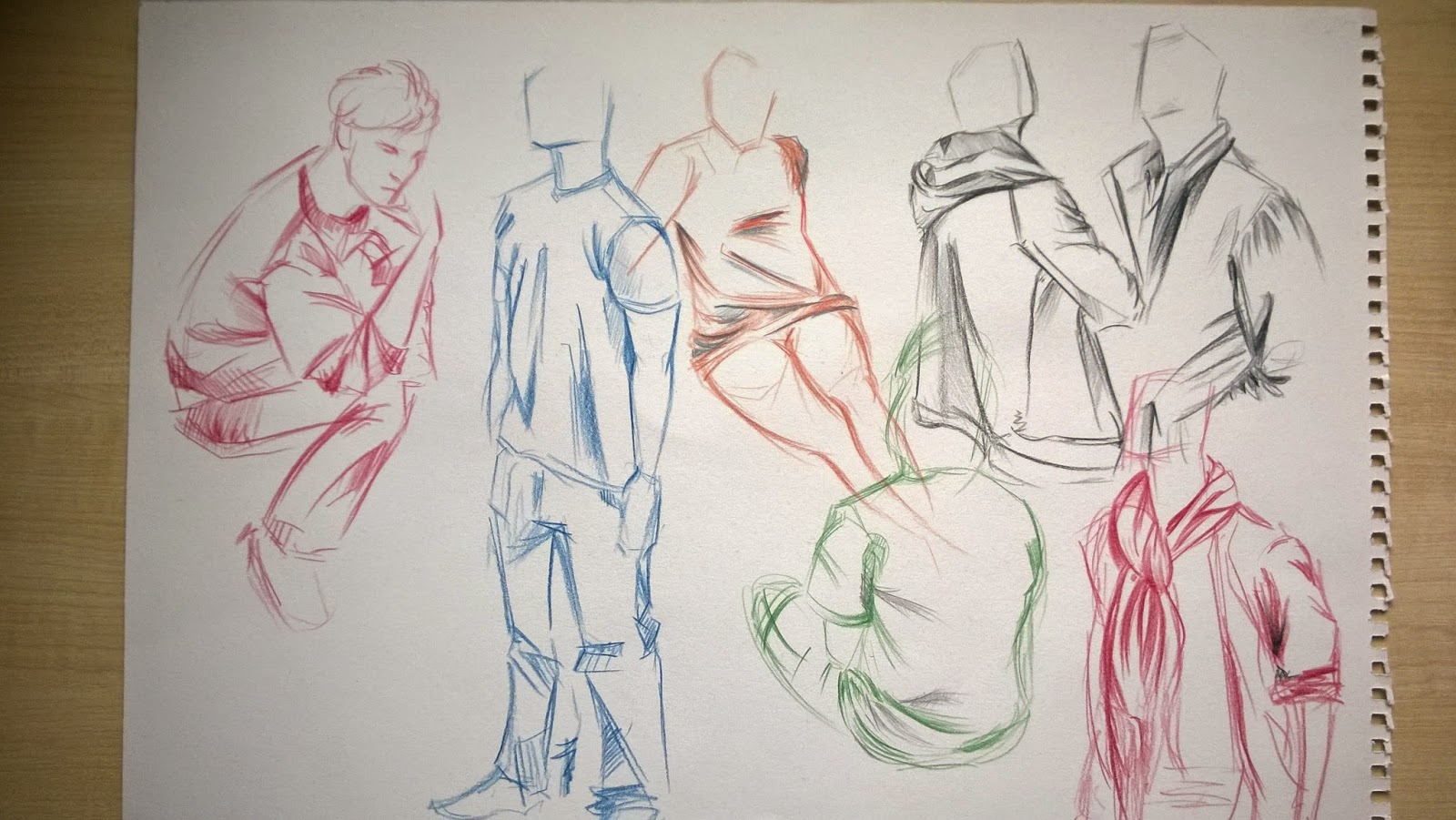 This week went very quick as the character project started. In life drawing the session took a turn and I had to draw my classmates. Of course it wasn't just drawing plain old standing poses, instead I had to focus on drawing only the clothes. The main focus was to draw the folds and creases, similar to last weeks session when rather than drawing the model I only had to draw the drapery. It was quite fun, because the poses were very quick and the models changed every few minutes. I used different materials and I think the colour variety is more pleasing to the eye.
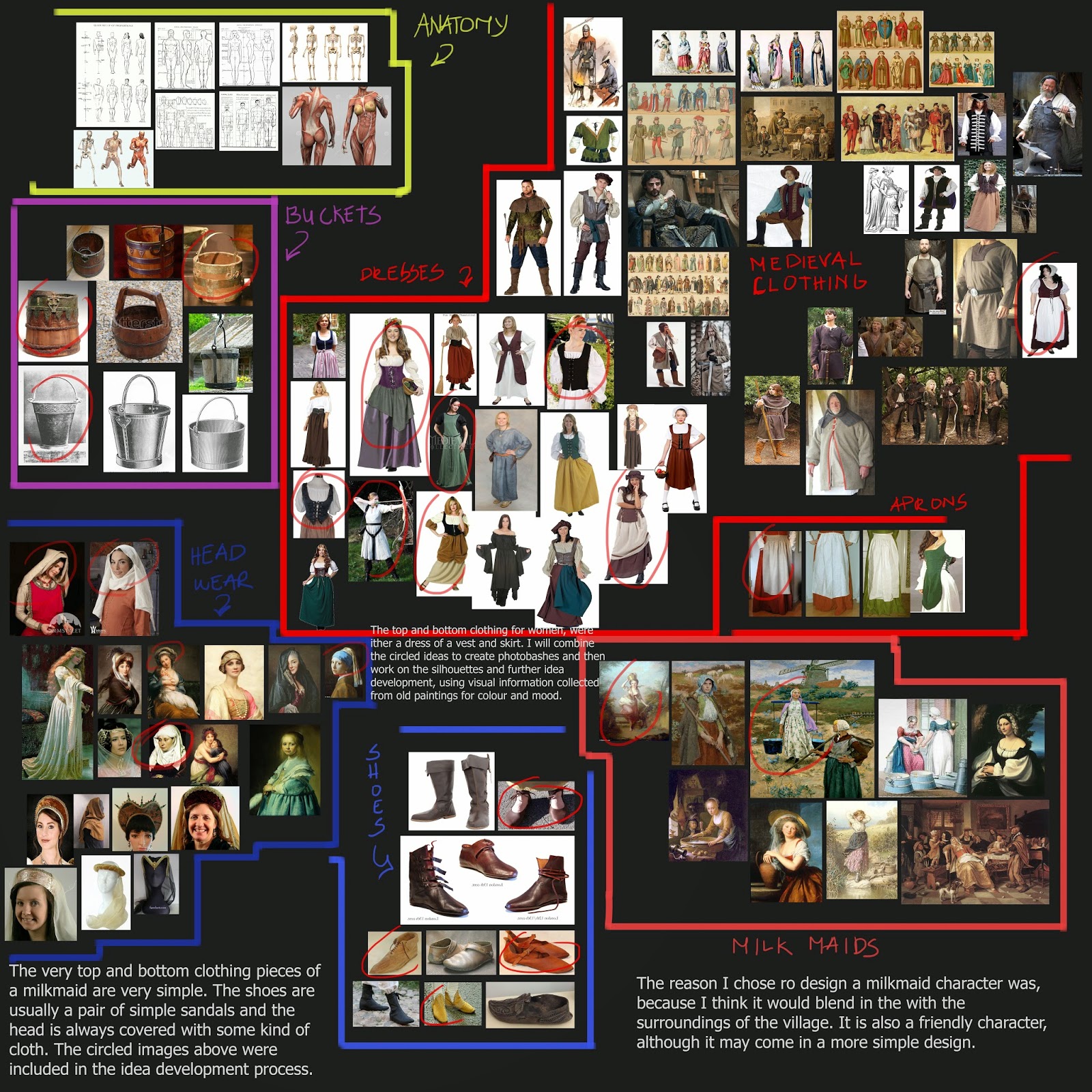 It was the first official week of the character project and had our initial idea review that week and the work uploaded here was edited according to the feedback received from the tutors.
The first step towards the design was to gather good visual information for the mood board. It was also important to separate each section in the mood board. I later used the same images in the mood board to do some photo bashing to create some quick ideas for my character.
I tried to move towards a character that would look something like milkmaid. I used some traditional ideas and some non-traditional ideas in my bashes. Later on I circled the characters I thought worked most with the theme of the milkmaid.


Week 17 The end of the BOOTCAMP
Another week of learning basics of character design, continued and so it was the last before starting serious work.
 In visual design we studied clothes and different materials and how they fold. Life drawing made us focus on how drapery falls on the human body. Also it was important to consider shadows and light on the material. The warm up drawing on the right did not go so well as I struggled most of the the with separating the figure from the drapery. Which is why in the longer poses I focused more on the separation of the cloth and figure. I do have to say it was difficult to draw the small creases and also leave out the very light parts on the material.
Further research continued with finding reference images of Medieval clothes and different materials.
 In game production we practised different folds and if materials bent properly on a rigged example model.
Critical studies introduced the Village character brief. It came with a generous triangle budget and quite a big surprise in the end. The surprise was that the character will be based on us, meaning paint overs and art will be done on pictures taken later on in the critical study day.
It's been three slow and easy weeks of learning basics and new things, but it is time to get back to work again. See you next week with some ideas for the character!
In visual design we studied clothes and different materials and how they fold. Life drawing made us focus on how drapery falls on the human body. Also it was important to consider shadows and light on the material. The warm up drawing on the right did not go so well as I struggled most of the the with separating the figure from the drapery. Which is why in the longer poses I focused more on the separation of the cloth and figure. I do have to say it was difficult to draw the small creases and also leave out the very light parts on the material.Further research continued with finding reference images of Medieval clothes and different materials.
In game production we practised different folds and if materials bent properly on a rigged example model.Critical studies introduced the Village character brief. It came with a generous triangle budget and quite a big surprise in the end. The surprise was that the character will be based on us, meaning paint overs and art will be done on pictures taken later on in the critical study day.
It's been three slow and easy weeks of learning basics and new things, but it is time to get back to work again. See you next week with some ideas for the character!
Week 16 Face topology
 The week started with studies of facial muscles and anatomy. We researched portrait paintings and various human faces, before we moved onto learning how to draw topology using front and side pictures of our face. The face topology pictures were used in 3DS Max as reference. I was quite relieved that face modelling was not as hard as I expected. And so I was quite happy with the outcome.
The face bellow was modelled using the images of my face topology. The same lines on the model you see bellow, were drawn onto my front and side pictures of my face. After the first time I finished modelling, the face looked a little melted down, as in very flat with no cheekbone definition. So I fixed it by altering the lines of the temples, cheekbones and jaw.

 |
| Different Facial Expressions |
Wednesday, 14 January 2015
Week 15 The human anatomy

It has been three weeks since the last project and it was time to go back to work. Term 2 started with learning the basic of anatomy. We looked at idealised human proportions and learned the average body measurements, like the average human body is 7,5 heads high and the legs are four heads high. The tutors were kind enough to provide the best anatomy material from books and also I have picked up a couple of other anatomy books specialised for artists for a refresher of the basics.
In life drawing the lesson brought me back to the basics as well and we did draw everything learned so far from term 1.
I do think I have improved greatly on life drawing. This class also allowed me to develop my understanding of how the human body works.
 |
| Although I have put in a little more effort into the first drawing because I was given more time, I noticed I have made a mistake by drawing the arm too short on the third body. I still enjoy quick gestural drawings as they are much more entertaining to do. |

Doing these exercises makes it easier to understand bone structure, plus facial muscles.
In game production I started making a low poly female body. The method used to create the model was planar modelling. The head was already pre-made, so all I had to do was extrude the shapes from the neck plane by plane following reference.
Another trick in this method of modelling, was that I only had to create one side of the body and then use a symmetry modifier to get a symmetrical copy of the half body. It kind of felt like connecting two pieces of an Easter chocolate bunny.
CRITICAL STUDIES!
The week ended with some new years resolution planning for the course. We were provided with plans containing boxes to fill in strenghts and weaknesses and how to improve in every area of the course. There was also a section in which I had to answer what could prevent me from making improvements. These are some goals I have set myself:
- Visual Design: Improve on my life drawing and value ranges. I will do that by purchasing a wider variety of pencils and practise more.
I would also like to work more on researching and taking my time on developing ideas more before moving onto final concepts. - Game Production: I would like to improve on modelling by also practising more with the techniques I've learned so far.
- Critical Studies: I have to admit, probably the hardest part of the course as it is unreasonably hard to write blogs every week. I want to start posting my blogs Sunday nights. Another important thing would be to work on my English skills, grammar, vocabulary and punctuation. Also perhaps the most important thing for me would be to become more analytical and descriptive about my work.
Thursday, 8 January 2015
Week 11 Conclusion of the Tree project and Term 1
The last week of the first term turned out to be a review week and for that reason it was a week full of self directed studies. The self directed time included an opportunity to do some clothed model sketching in the Life Drawing studio. The students were allowed to choose what to draw, so me and a couple of other students asked the model to do some quick sketches of different seated and standing poses. This would have counted as primary research for the upcoming Stylised Character project.

I moved onto modelling the trees in 3DS Max. The project introduced two new techniques for making 3D models. One of them was creating the tree drawing an NGon and a line for the base of the tree. Then I created a loft along the guidelines and continued creating spline lines. Up to that point there was no need to change the model to an editable poly. I only needed to change the object to editable poly for extruding branches along the created splines.
I had applied the bark texture to the loft right after it was created and for that reason there was no need to unwrap it, only the branches needed it.
 |
| Example of the tree branch with Alpha Channels applied |
After unwrapping, phase two of the tree creation started with creating a tree branch and leaves. Adding a single new Alpha Channel made the texture transparent in 3DS Max.
To finish the model I had to copy around planes with the branch texture applied to it and the model was done and ready to port to the Unreal Engine.

The trees could have been improved in more than one way.
To improve my tress I could create a different tree with more branches going out of it. I could also change the colours and add more chunkier leaves for the alpha textures. Perhaps adding more branch and leaf planes to the trees could make it look more rich with leaves. Also the branches of the tree could have been made longer to look more realistic.
In conclusion I am quite happy with the trees as they do not look alien to the village when in engine.
So far I love the course and I've learned so much in such a little time. I look forward to what the next term will teach me and how I will develop as a person and an artist.
Week 10 The tree project
Week 10 was the start of the Stylised Tree project. It was an easier project compared to the previous house project, but it came with it's own challenges and new techniques to learn. But before I tested out the new ways of making the 3D models I did my primary research by gathering first hand research of images from parks. It came as a benefit that the trees were leafless this time of the year, as it was easier to learn how organic objects tend to grow. The other steps I took were gathering interesting images from the internet and then making of mood boards.
I drew silhouettes of trees and then copied the silhouettes around and changed the appearances to create as many different trees as I could. Then my work development continued with making the decisions of which silhouettes seemed most interesting to me, the ones I chose to develop further I started rending out some dark grey values to have an idea what the silhouette would look like in a more 3D form. Painting in values into the silhouettes is probably one of my favourite part in the development. It is most exciting to see a flat shape gain more of a 3 dimensional look. After the silhouettes were done I have gathered some opinions from my classmates and friends to know which tree drawings seemed most interesting to them. I had also to keep in mind that I had to follow the same style guide and avoid making my tree too skinny. So after the big decision making I chose two trees that I thought were most interesting and what suited the given style and painted the trees from angles I will need to use when making my tree in the 3Ds Max.
Those angles were later copied multiple times to do some colour tests for the trees.
The week was not all about creating concepts of trees, we did some shadow and light drawings in Visual Studies. We used charcoal and white chalk to investigate how lighting reflected on a human body. The challenge was to only sketch out the brightest and the darkest tones of the body and mid tone paper did the rest of the work. I think I could have done better, as I am still trying to improve on balancing how many shades of light and dark I can use when creating drawings.

 |
 |
| Chosen ideas for the 3D models |
I drew silhouettes of trees and then copied the silhouettes around and changed the appearances to create as many different trees as I could. Then my work development continued with making the decisions of which silhouettes seemed most interesting to me, the ones I chose to develop further I started rending out some dark grey values to have an idea what the silhouette would look like in a more 3D form. Painting in values into the silhouettes is probably one of my favourite part in the development. It is most exciting to see a flat shape gain more of a 3 dimensional look. After the silhouettes were done I have gathered some opinions from my classmates and friends to know which tree drawings seemed most interesting to them. I had also to keep in mind that I had to follow the same style guide and avoid making my tree too skinny. So after the big decision making I chose two trees that I thought were most interesting and what suited the given style and painted the trees from angles I will need to use when making my tree in the 3Ds Max.
Those angles were later copied multiple times to do some colour tests for the trees.
 |
| I tried to choose harmonious colours for the trees and at the end I chose which colours to use for the textures. |
Subscribe to:
Posts (Atom)